Thursday, July 9, 2009

WORST DVD ART OF ALL TIME: Northwest Frontier

Sometimes studios will change the dvd art of their movies in order to identify which discs are "for rental only" -- sold to Netflix or Redbox or Blockbuster. Basically all they do is put no dvd art, with ony the title across a grey disc. (I'm not sure exactly why they make the distinction between rental only discs in the first place. I guess in order to prevent resell.) But here it is, the worst dvd art of all time. Not a rental art disc, but an honest to God "for purchase" production dvd:

Riveting, isn't it? White background, bold black letters. Wow. You may ask, just what is this steamroller of a film about that would inspire such cataclysmic artwork? Here's the summary:

When the rajah of British India's most northwestern province is slain during a massive uprising, English army officer Captain Scott (More) is ordered to rescue the 5-year-old heir to the throne and speed the child to safety. Boarding their only means of escape - a decrepit old steam locomotive - Scott and the boy race to farway Kalapur, accompanied by a tempestuous governess (Lauren Bacall), a handful of passengers and an undercover enemy agent. Hurtling across 300 miles of rebel-held territory, Scott battles impossible odds on a perilous cross-country train ride jam-packed with hair-raising native attacks, death-defying bridge crossings and white-knuckle last-minute escapes!

I don't know about you, but I'd at least give it a look. So what about the dvd box cover art?


What could be the problem? Put that train on the disc!

Wednesday, July 8, 2009

Film Diary MARCH 2009

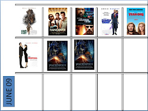
March was a little on the slow side. WATCHMEN proved interesting but in the end confusing (didn't we end up just where we started? The good guys were the bad guys? And why did the writer hate Nixon so much. I mean, he really seemed to hate Nixon.) RACE TO WITCH MOUNTAIN was a throwback to old school Disney when they made movies like BLACKBEARD'S GHOST and POLLYANA and THE BOATNIKS and you were a kid and you watched them and thought they were great cause you didn't know any better. DUPLICITY had some excellent dialogue and good scenes but in the end we'd like our heroes to win, thank you very much. (Makes them at least appear to be smart and clever; think THE STING). MONSTERS VS ALIENS was in 3D. KNOWING was strange and creepy in the end (what's up with the little kids taken to an alien world who are eventually supposed to repopulate the Earth -- just weird all over). The best of the month was definitely I LOVE YOU MAN.


Poster Art: DISTRICT 9


Every now and then a movie comes along that is the essence of "intriguing." DISTRICT 9 may not live up to the creeping attention that it is getting, but I'm definitely going to be at the head of the line to see it...


DVD Menu Art: LEGEND OF BLOOD CASTLE

Let's just call this "how not to make DVD menu art." It's not hard to find unimaginative examples of menu art for DVDs. Film is a creative medium. You're paying for an experience, whether it's in the theatre or at home watching a movie on tv. What I don't understand is why a company has gone to all of the trouble to make a film (and making film is definitely a hard edged struggle to get financing and distribution) just to give up when it comes to representative things like poster art or dvd art. This menu system and art seems to have been cooked up by some fifth rate outfit from a template. If the DVD menu art makes you want to fall asleep, what do you think the film itself will do?

Monday, July 6, 2009

DVD Menu Art: Quantum of Solace